HTML and mobile browsers
24 Oct 2019 23:06:54 rantI don’t understand HTML rendering anymore. I understand h1, h2, p structure. However it seems that on mobile not all equal text is created equal.
While I’ve been trying to rebuild my website will slightly more modern tools, I’ve come to realise browsers today have a lot more say in how content is rendered. Not only do developers have much more control over specifics of how stuff is rendered, but now browsers have their tentacles in this mess too.
Admittedly in general mobile (or “responsive”) browsers are doing a fine job resizing text elements to better fit on a small screen. They cleverly resize elements to reduce the amount of otherwise empty wasted space. If you look at my work on desktop I find it agreeable. If I look at the same page on mobile using its desktop mode, there’s tons of empty space. In mobile mode, most of the waste is gone and result looks good.
As good as the logic is, sometimes its behaviour seems rather arbitrary to me. https://drafts.csswg.org/css-size-adjust/ explains the culprit nicely. That is, if you’d catch the fine details in it. I don’t. Let me demonstrate my pain.
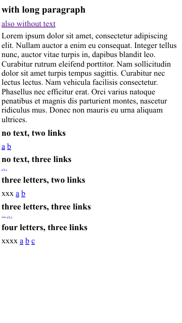
Plain HTML page, no CSS. Header, optinally a text paragraph, lesser header, a div with text (optionally) and some links. How large the glyphs are rendered in the divs depend on the content. I can’t quite figure out the logic. Go figure.
See how the page with text and the other without text renders on your device.
Below are captures from developer mode of Chromium 76.0.3809.100 in mobile mode. The third image is a capture from desktop view for comparison.